Wednesday, 30 March 2016
Thursday, 24 March 2016
EDITING Contents (Extended)
I felt as though I needed to tie in the pink from the front cover into the contents page.
So to make the music charts stand out more I added pink boxes behind the text and decreased the opacity so it wasn't too harsh.
EDITING Contents (Extended)
A long the bottom of the page I have began to add different sub-sections of the magazine.
I highlighted the heading and key words with the shade of the blue used on the front cover to follow the house theme.
This is how the page looks right now.
EDITING Contents (Extended)
This is what my contents extended page looks like to far.
I added the yellow bar along the bottom too start to add the theme of the magazine by using the house colours.
EDITING Contents (Extended)
Like Billboard, I added the current music charts to the contents page.
I used the same font as the front cover to follow the theme.
EDITING Contents (Extended)
I started with my main image for the contents page.
However I found this image too dull for the genre of my magazine so I edited it using the Brightness and Contrast in Photoshop.
AFTER
EDITING Contents (Extended)
This is my current Contents page for my music magazine - Beat.
As I am going to make a double page I decided to replace the Top 10 Downloads with one of my own images as I am going to expand the music downloads onto the next page. This is a typical convention of Billboards contents pages which is inspiring my magazine.
EDITING Contents (Extended)
I have decided to make my contents into a double page spread instead of just a single page as I could get more information included. This will also allow me to use more conventions of music magazines.
Wednesday, 23 March 2016
EDITING Double Page
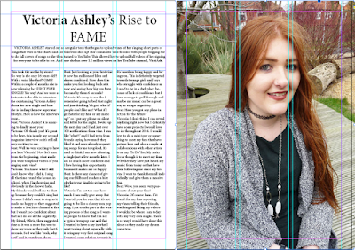
I took a quote from the article and enlarged it to make it stand out. This is a convention of magazine articles.
Wednesday, 16 March 2016
Monday, 14 March 2016
EDITING Double Page
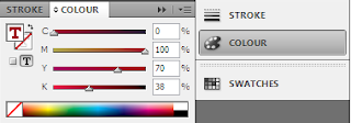
I took the same colour as I used for Victoria Ashley is the masthead and changed the questions being asked by the magazine to that same colour.
This makes the questions stand out on the page more. This will also make it easier for the reader to differentiate between question and answer.
It is also a typical convention of magazine interviews.
Social media links are added at the end of the interview as the target audience for this magazine is teens and they spend hours on social media platforms.
EDITING Double Page
I started by editing the masthead for the double page feature.
I wanted the name Victoria Ashley to stand out on the page as she is the main focus. So I used a handwritten styled font so it adds a personal affect and then changed the colour of the text.
Tuesday, 8 March 2016
EDITING Double Page
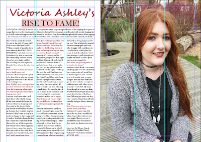
I added the text to the left page which includes the title, introduction and the interview.
Next I will adjust the colours and fonts to make the article link to the theme of the magazine.
EDITING Double Page
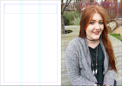
I have created my double page feature using InDesign.
First I started off by placing guidelines onto the double page so the proportions were correct on the pages.
I then added the main image onto the right page of the model that is on the front cover as she is the subject of the main feature in this magazine feature.
Monday, 7 March 2016
EDITING Contents
To add in more of my theme colours from my front cover I added boxes behind the Top 10 Downloads.
Also changed the colour of the magazines title at the top of the contents page.
I used the Colour Selection Tool to use the same colours that were used on the front cover.
EDITING Contents
I changed the colour of the boxes as I needed the contents page to have the same theme as my front cover. So I used the Colour Selection tool to pick up the blue background from the front cover.
I also done this to the line beneath the logo but I used the yellow instead of the blue so it wasn't all the same colour.
EDITING Front Cover
I decided to change the main image on my front cover to make the model look more like a pop culture theme.
With this I changed the coloured background to compliment the models outfit.
EDITING Contents
I added the main image to the contents page. This is the same model as who is on my front cover as she is what the main story is based on in this magazine feature.
And then added the page number that corresponds to the correct story.
EDITING Front Cover
I decided to add a 'free 1D poster inside' as this will draw in One Direction fans. This will also tell the audience what genre of music will be included in the magazine.
EDITING Front Cover
I added the main storyline to the front cover.
I made the text large and go across the model to tell the audience what the main story is for this magazine.
I used the same shade of pink that is in the title so it ties in with the theme.
The white text also stands out on the background so it is easy for the audience to read.
I added the barcode, price and magazine website along the bottom of the front cover as these are typical conventions of magazines.
Having a website for the magazine tells the audience that they can interact with other people with the same interests as them via the website.
Friday, 4 March 2016
EDITING Front Cover
I added the story hooks onto the front cover.
I highlighted the key words by using yellow font as it contrasts against the blue background. It also ties in with the yellow in the title.
Adding the tagline 'Britain's Best Music Magazine 2016' is a convention of magazines as it attracts readers.
Subscribe to:
Posts (Atom)


