Sunday, 13 November 2016
Saturday, 12 November 2016
My Filming Plan
Friday, 11 November 2016
Wednesday, 9 November 2016
Tuesday, 11 October 2016
Monday, 10 October 2016
Monday, 3 October 2016
Saturday, 1 October 2016
Magazine Reviews Analysis
I analysed film reviews from the magazine Little White Lies which is a very popular film magazine.
Each magazine published is individually designed inspired by their feature film.
I really like the designs of their reviews. It is very simplistic which includes a main body text, one or two large images from the film and they also include a rating system. This will help the readers to find out more about the film and the overall review.
Colloquial language is used within the review as this helps create a relationship with the reader. Using this suggests they are targeting towards a young adult audience.
Wednesday, 28 September 2016
Tuesday, 27 September 2016
Monday, 26 September 2016
Friday, 23 September 2016
Thursday, 22 September 2016
Wednesday, 21 September 2016
Tuesday, 20 September 2016
Tuesday, 28 June 2016
Tuesday, 21 June 2016
Filming and Editing Practice
we created a news segment. We added an opening and typical news programme music from IMovie
First Filming and Editing Practice
As we are starting Year 13 coursework in September, we were asked to get into small groups and practice filming and editing in preparation for our coursework.
Tuesday, 14 June 2016
Idea for Short Film
Friday, 10 June 2016
A2 Media Studies
I am beginning my media studies A2 coursework. This includes a main and ancillary text as well as research, planning and evaluation which will be presented on this blog.
After reading through the 12 options for my coursework, I have chosen one question that I found more interesting to produce.
I have chosen:

After reading through the 12 options for my coursework, I have chosen one question that I found more interesting to produce.
I have chosen:

Tuesday, 3 May 2016
Monday, 25 April 2016
Tuesday, 19 April 2016
Monday, 18 April 2016
Friday, 15 April 2016
Wednesday, 30 March 2016
Thursday, 24 March 2016
EDITING Contents (Extended)
I felt as though I needed to tie in the pink from the front cover into the contents page.
So to make the music charts stand out more I added pink boxes behind the text and decreased the opacity so it wasn't too harsh.
EDITING Contents (Extended)
A long the bottom of the page I have began to add different sub-sections of the magazine.
I highlighted the heading and key words with the shade of the blue used on the front cover to follow the house theme.
This is how the page looks right now.
EDITING Contents (Extended)
This is what my contents extended page looks like to far.
I added the yellow bar along the bottom too start to add the theme of the magazine by using the house colours.
EDITING Contents (Extended)
Like Billboard, I added the current music charts to the contents page.
I used the same font as the front cover to follow the theme.
EDITING Contents (Extended)
I started with my main image for the contents page.
However I found this image too dull for the genre of my magazine so I edited it using the Brightness and Contrast in Photoshop.
AFTER
EDITING Contents (Extended)
This is my current Contents page for my music magazine - Beat.
As I am going to make a double page I decided to replace the Top 10 Downloads with one of my own images as I am going to expand the music downloads onto the next page. This is a typical convention of Billboards contents pages which is inspiring my magazine.
EDITING Contents (Extended)
I have decided to make my contents into a double page spread instead of just a single page as I could get more information included. This will also allow me to use more conventions of music magazines.
Wednesday, 23 March 2016
EDITING Double Page
I took a quote from the article and enlarged it to make it stand out. This is a convention of magazine articles.
Wednesday, 16 March 2016
Monday, 14 March 2016
EDITING Double Page
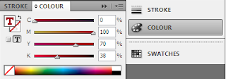
I took the same colour as I used for Victoria Ashley is the masthead and changed the questions being asked by the magazine to that same colour.
This makes the questions stand out on the page more. This will also make it easier for the reader to differentiate between question and answer.
It is also a typical convention of magazine interviews.
Social media links are added at the end of the interview as the target audience for this magazine is teens and they spend hours on social media platforms.
EDITING Double Page
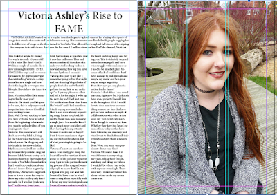
I started by editing the masthead for the double page feature.
I wanted the name Victoria Ashley to stand out on the page as she is the main focus. So I used a handwritten styled font so it adds a personal affect and then changed the colour of the text.
Tuesday, 8 March 2016
EDITING Double Page
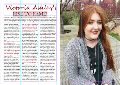
I added the text to the left page which includes the title, introduction and the interview.
Next I will adjust the colours and fonts to make the article link to the theme of the magazine.
EDITING Double Page
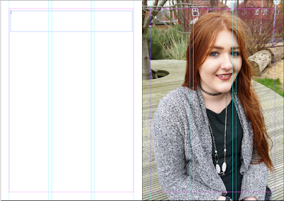
I have created my double page feature using InDesign.
First I started off by placing guidelines onto the double page so the proportions were correct on the pages.
I then added the main image onto the right page of the model that is on the front cover as she is the subject of the main feature in this magazine feature.
Monday, 7 March 2016
EDITING Contents
To add in more of my theme colours from my front cover I added boxes behind the Top 10 Downloads.
Also changed the colour of the magazines title at the top of the contents page.
I used the Colour Selection Tool to use the same colours that were used on the front cover.
Subscribe to:
Comments (Atom)


