Tuesday, 15 December 2015

EDITING Front Cover 2

 
I felt like the top of the cover was too bare. So I added a bubble advertising a free poster inside the magazine.
This will also draw in the fans of 1D as they may want the poster.
I then added a barcode, price and website at the bottom as this is a typical convention of magazines.


EDITING Front Cover 2

 
I added my storylines to the front cover.
I took the colour from the masthead and used it to highlight key words.
 
I added a faint red box behind the story line in the centre to make it stand out from the others surrounding it.


EDITING Front Cover 2


I added the main headline as a banner onto the front cover but it was difficult to read the text so I added a faint white box.


EDITING Front Cover 2


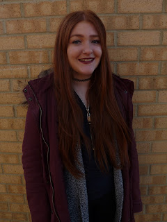
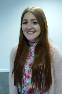
I decided to re-do my front cover as my images were not very good quality.
I used a different model and natural lighting which made the editing process of the image much quicker. I picked this image based on Marjorie Fergusons theory of facial expressions and picked the Super Smiler expression as it draws in the audience.
I then added my masthead and changed the colour from green to purple as it contrasts with the background to make it stand out more.

Tuesday, 8 December 2015

Lighting Change

 
I started off with this photograph of my model, Lucy. However, the lighting was too dull for a pop magazine so I asked my target audience their brightness preferences.


My target audience preferred the brightness increased to 75%

More Photographs


I tried a different outfit that fitted the genre of my magazine better.


Friday, 4 December 2015

EDITING Front Cover Image

 
With this photograph, I removed the background using the Quick Selection Tool. However, this leaves a green shadow on the model.
 
I tried adjusting the colour levels to get rid of the green.


I couldn't manage to get my model a 'normal' skin colour and this is the case for all the images I had took.
 
So, I am going to take some photographs outside of school so I can use natural lighting and a variety of backgrounds.


Initial Photos Explanation

Tuesday, 24 November 2015

Changing Front Cover Photo...

When I was looking closer at my front cover to double check I had everything a music magazine front cover needs, I noticed a mark on my models leg.
 
I tried to cover it by using the colour replacement tool but you could still notice it.
So I have decided to take some new photos outside of school so they shouldn't need edited as much.


Tuesday, 10 November 2015

EDITING Front Cover.

I have started to add the story hooks onto the front cover.
 
Main Storyline:


I used the font Berlin Sans FB Demi for the name Victoria Ashley but I used the font Birch Std for the rest of the text. I done this so her name would stand out to the rest of the page as it is different font. I also made her name a different colour with a black drop shadow to make it pop out on the page.
 
Other Story Hooks:
 
I started off by using a simple font called Berlin Sans FB Demi.
Having all the text in black looks too boring for a pop music magazine so I decided to add boxes around some of the texts which are the same colour as the masthead.
 
I still felt like it needed a bit more colour so I highlighted more words by making the text a coral colour which I took from the models outfit.
 
This is what my magazine front cover looks like over all.
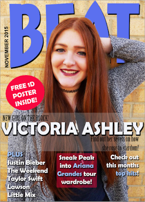


EDITING Front Cover.

I produced a survey to decide what colour title my target audience preferred.
The majority of the vote was for he green title as it stood out the most against the model and her outfit.
 
 
I added a drop shadow to the title to make it stand out from the background more.


Tuesday, 3 November 2015

EDITING Front Cover.


I added the title of my magazine, BEAT, onto the front cover.

I have placed the title behind the model so it doesn't cover the models face.

This is also a common convention for magazines.


I thought the title was too plain for a pop music magazine so I decided to play around with the colours.
 
I selected some of the colours from her outfit so it would tie in.